Categories
Tags
Archives
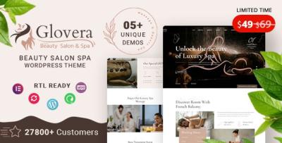
Glovera Spa Theme: My “Booking Flow” Incident Report
-
Glovera Spa Theme: My “Booking Flow” Incident Report
I installed Glovera - Beauty Salon Spa WordPress Theme after what I now call “The Tuesday Appointment Meltdown”: a salon site that looked absolutely serene… while the booking flow quietly sabotaged conversions. The homepage was glossy, the gallery was gorgeous, the typography was giving “luxury,” and yet the one thing that mattered—the point where a visitor becomes a booked customer—was fragile. Buttons moved on mobile. Pages loaded heavy. An editor changed a single section and the CTA disappeared from a high-traffic page like it was practicing mindfulness.
So this isn’t a polished theme tour. It’s an admin-first build journal with a technical spine: what I checked under the hood, what patterns I locked down, how I structured content so it scales, and how I kept the site calm for humans while being predictable for machines.
If you manage a beauty salon, spa, lash studio, barbershop, or wellness brand site, you already know the truth: your website is not “a brochure.” It’s a booking system wearing a branding layer.
Style shift: “SRE on a spa day” (yes, that’s a thing now)
Most spa theme reviews read like scent descriptions. “Creamy. Luxurious. Soothing.” That’s lovely, but I’m the person who gets pinged when:
-
the booking CTA vanishes on mobile,
-
the hero image becomes the LCP villain,
-
the gallery scripts slow down every page,
-
and marketing asks for “just one small change” that breaks three templates.
So I treated this build like a reliability project with soft lighting.
My goal was to ship a site that:
-
feels premium and calm,
-
supports frequent edits without layout chaos,
-
stays fast on mobile,
-
and keeps the booking flow stable across campaigns, seasons, and promotions.
Why salon/spa sites are deceptively hard (the real requirements)
A salon/spa website has special constraints that demos rarely show:
-
hasty decision-making on mobile: people book between errands, not at a desk
-
service menus that grow forever: new packages, seasonal offers, memberships
-
staff pages that must feel human: bios, specialties, schedule hints
-
trust content that reduces anxiety: pricing clarity, duration, hygiene standards, cancellation policy
-
image-heavy pages: galleries, before/after, ambience
-
local SEO: location pages, hours, maps, service areas, reviews
A theme has to support all of that as a system, not as a one-time demo import.
First principle: treat the site as “content models,” not pages
As an admin, the fastest way to chaos is building everything as one-off pages:
-
one page per service with custom styling
-
one landing page per promotion with unique layout
-
random sections copied from old pages
Three months later, your brand consistency is gone. Updates are risky. And the booking CTA shows up in six different styles.
So I structured the Glovera build around content models:
-
Services (with consistent fields and repeated patterns)
-
Treatments / Packages (tiered pricing and duration)
-
Team / Practitioners (bio + specialties)
-
Gallery / Results (curated sets)
-
Policies / FAQs (repeatable, always current)
-
Landing pages (campaign-ready, but controlled)
Even if you implement these models as simple WordPress pages, you can still enforce “model rules” by using templates, reusable blocks, and a single layout pattern per content type.
That’s the mindset that makes a spa site maintainable.
My first 30 minutes with Glovera: the admin sanity checklist
Before I touch colors and hero images, I run checks that save me from late-night debugging.
1) Layout stability check (CLS is a conversion tax)
For booking-centric sites, layout shifts are deadly. If the page jumps while the visitor tries to tap “Book Now,” you lose trust instantly.
So I tested:
-
image placeholders and aspect ratio consistency
-
sections that load late and push content down
-
“sticky” elements that appear after load
-
mobile menu transitions
I aim for “boring stability.” Calm is a UX feature.
2) CTA consistency check (the “don’t hide the money button” rule)
If you rotate campaign banners, you’re going to edit pages. If you edit pages, CTAs drift.
I enforced two rules:
-
One primary CTA style across the site
-
One CTA placement pattern per page template
Examples:
-
Service page: CTA after the first section + CTA near pricing
-
Team page: CTA after specialties + CTA after availability text
-
Landing page: CTA above fold + CTA after social proof
That’s how you stop “Book Now” from becoming a random design element.
3) Content density check (services need scan-friendly structure)
Visitors don’t read; they scan:
-
duration
-
price range
-
what’s included
-
prep instructions
-
what to expect
-
aftercare
-
cancellation policy
So I looked for a layout rhythm that supports:
-
short paragraphs
-
lists and bullets
-
small “info strips” (duration, price, intensity)
-
clear headings
Glovera’s calm aesthetic direction makes this easier—especially if you keep sections consistent.
Under the hood: what I assume and what I control
I’m not going to pretend that any theme magically guarantees reliability. Themes are frameworks. You still have to operate them well.
So I made two categories:
Assumptions (the “typical modern WP theme stack”)
Most modern themes will:
-
enqueue front-end assets (CSS/JS)
-
provide templates and section layouts
-
support common builder workflows
-
rely on standard WP template hierarchy
-
integrate with common plugins and widgets
I assume that baseline and focus on what I can fully control.
Controls (the “admin levers” that actually matter)
-
content structure and reusable patterns
-
performance budget (images, fonts, scripts)
-
plugin discipline (avoid overlapping features)
-
conversion flow (booking CTA, forms, confirmation steps)
-
update safety (child theme / safe overrides, minimal template rewrites)
That’s where real outcomes come from.
The booking funnel: think like an engineer, not a designer
Here’s the funnel shape for salon/spa bookings:
-
Visitor lands on a service page (or campaign page)
-
Visitor checks: price / duration / trust signals
-
Visitor wants to know: “What happens next?”
-
Visitor taps CTA
-
Booking form loads (this is where sites die quietly)
-
Confirmation and follow-up message
A theme can support steps 1–4 beautifully. Step 5 usually depends on your booking plugin or form system. But the theme still matters because it shapes the “confidence ramp” into the booking step.
So I built the page structure to reduce hesitation before the form even loads:
-
clear service outcomes and contraindications
-
explicit durations and price ranges
-
short “first visit” section
-
cancellation policy snippet (calm tone)
-
hygiene/safety note (if relevant)
-
social proof (testimonials, reviews, before/after)
This is conversion engineering pretending to be content.
My service-page template (the one that scales)
If you run multiple services, this template saves your life:
Service Overview (above the fold)
-
one-line description (“Hydrating facial for dull skin with gentle exfoliation”)
-
duration and starting price
-
who it’s for
-
primary CTA
What’s included
-
4–6 bullets, no long paragraphs
What to expect
-
step-by-step, short lines
-
include pain level/sensation guidance if relevant
Results / outcomes
-
realistic, not hype
-
“typical results after X sessions” if appropriate
Prep & aftercare
-
short bullets, “do / don’t”
FAQs
-
cancellation
-
contraindications
-
how often to book
-
compatibility with skin types / conditions (careful: avoid medical claims)
CTA + trust strip
-
booking CTA
-
“response time” or “confirmation details” if manual approval is used
-
policy link section (no need to overwhelm)
When every service page uses the same scaffolding, you get:
-
faster updates
-
consistent user experience
-
fewer editor mistakes
-
better SEO internal linking structure
The performance reality: salon sites are image-first
Salon/spa sites are often photo-heavy for a good reason:
-
ambience sells
-
“before/after” sells
-
staff personality sells
But images are also your biggest performance risk.
So I run a performance budget like this:
Rule 1: LCP protection (your hero is guilty until proven innocent)
The largest element on the page is often the hero image. If it’s oversized or not optimized, your site feels slow even when it isn’t “broken.”
My approach:
-
pick the smallest acceptable hero image dimensions
-
compress aggressively without visible artifacts
-
avoid loading multiple hero slides
-
keep the above-the-fold layout lightweight
Rule 2: Galleries should be curated, not infinite
A spa gallery can easily become 40 images because “we have great photos.” That’s how you turn a page into a loading problem.
Instead:
-
show 9–12 curated images
-
link to “more results” pages if needed
-
avoid heavy lightbox scripts sitewide unless truly necessary
Rule 3: Fonts are silent performance killers
Premium sites love typography. But multiple font families and weights:
-
increase requests
-
delay text rendering
-
cause layout shifts if fallbacks differ
I keep it simple:
-
one primary font family
-
2–3 weights maximum
-
consistent sizes across templates
Rule 4: Animation is a spice, not a meal
Subtle transitions can feel luxurious. Too many effects feel cheap and slow.
If you want “premium calm,” you want:
-
minimal motion
-
consistent spacing
-
clean contrast
-
confident typography
Glovera’s overall vibe is compatible with restraint, which matters more than people admit.
Why “edit safety” is the most underrated feature
On salon sites, edits happen constantly:
-
new offers
-
holiday packages
-
updated prices
-
staffing changes
-
time-sensitive banners
The enemy is “layout drift.”
Layout drift happens when editors:
-
copy old sections from random pages
-
tweak spacing to “make it look right”
-
introduce inconsistent heading styles
-
create “special cases” everywhere
So I built guardrails:
Guardrail 1: reusable blocks (or section patterns)
Instead of creating new sections each time, I use repeatable patterns:
-
“Service highlight” block
-
“Trust strip” block
-
“CTA + policy note” block
-
“Before/after gallery grid” block
-
“Pricing tiers” block
When edits are made using known blocks, your site stays consistent.
Guardrail 2: global CTA styles
I keep CTA designs centralized. If the button changes, it changes everywhere—not page by page.
Guardrail 3: one promotional landing template
Promotions are unavoidable. But they should use a controlled template:
-
headline + short offer explanation
-
three bullets
-
price/duration
-
social proof
-
CTA
-
FAQ
No experimental layout. No “we can do anything in a page builder” chaos.
The “bottom-layer” customization strategy (update-safe)
If you plan to operate the site long-term, you’ll adjust things. So do it safely.
1) Child theme early (even if you think you won’t need it)
Common tweaks that become necessary:
-
button/CTA styling consistency
-
spacing improvements for service page readability
-
minor typography adjustments
-
special styling for policies and FAQs
Put those in a child theme so updates don’t scare you.
2) Prefer small, targeted overrides
Avoid rewriting large templates unless you absolutely must. Large overrides age poorly.
3) Keep business logic outside the theme
If you add logic like:
-
showing different CTAs by category
-
inserting policy boxes automatically
-
adding conditional banners for seasonal offers
Do it with hooks/snippets or a tiny site plugin—so the theme remains a presentation layer.
Where WooCommerce fits (even for a salon)
Not every salon needs ecommerce. But many eventually want:
-
gift card products
-
product bundles
-
paid memberships
-
prepaid packages
-
merch or retail add-ons
If you’re planning for that path, you can keep the store experience cohesive by choosing compatible layouts across the ecosystem of WooCommerce Themes and aligning typography and spacing early—so “Shop” doesn’t feel like a different website.
The key is cohesion: booking and selling should feel like the same brand.
My “break-it-on-purpose” tests (because real life is messy)
I tested realistic failure modes:
Test 1: “Long service page” stress
I wrote a long service description with multiple sections, lists, and FAQs. The page remained readable and didn’t feel like a wall of text.
Test 2: “Before/after gallery chaos”
I uploaded images with inconsistent dimensions (because real before/after sets rarely match). The trick that worked: enforce a consistent aspect ratio in the grid so visual rhythm stays calm.
Test 3: “Editor drunken copy-paste”
I pasted text from a doc with strange formatting and extra line breaks. A solid layout should survive this with minimal cleanup.
Test 4: Mobile CTA thumb test
I used the site one-handed like a real visitor would:
-
can I find the CTA quickly?
-
is the button large enough?
-
does the page jump while loading?
-
is the menu usable without precision tapping?
These tests are unglamorous, but they catch the issues that actually impact bookings.
The trust layer: what spa sites must communicate clearly
Spa/salon clients often hesitate for the same reasons:
-
“Will it hurt?”
-
“Will it work for my skin/hair?”
-
“Will it be awkward?”
-
“What if I’m late?”
-
“What if I need to cancel?”
-
“Is it clean and safe?”
So I built small trust sections:
-
“First visit” expectations
-
cancellation policy summary (calm, no threats)
-
hygiene and safety note
-
realistic outcomes timeline (avoid hype)
-
aftercare basics
A theme that supports calm, structured content makes this trust layer easy to present without stuffing the page.
Who Glovera is best for (admin perspective)
Glovera is a strong fit if you:
-
run a salon/spa/wellness site where booking is the core action
-
publish multiple service pages and seasonal offers
-
want a premium calm aesthetic without heavy gimmicks
-
care about stable mobile UX and edit safety
-
plan to scale content without redesigning the site every month
Be cautious if you:
-
plan to overload pages with animations and huge sliders
-
expect a theme to replace your booking plugin and operational workflows
-
want every page to be a unique experimental layout (that becomes maintenance debt)
My rollout plan (the “minimal drama” version)
Phase 1: structure first
-
define service page template
-
define CTA placement rules
-
define trust strip and policy snippets
-
create one promo landing template
Phase 2: performance pass
-
compress hero images
-
enforce aspect ratios for grids
-
limit fonts and animation
-
test mobile stability
Phase 3: content scaling
-
publish essential services first
-
expand to staff bios and specialties
-
add galleries in curated sets
-
build local SEO pages if needed
Phase 4: operational polish
-
confirm booking confirmations and follow-up
-
add “first visit” clarity
-
ensure policies are consistent sitewide
This is how you maintain a calm premium brand while keeping the backend predictable.
Final notes (from one admin to another)
A salon theme succeeds when it keeps the booking path stable and the editing workflow safe—because those two things determine whether your site actually performs as a business tool. Glovera’s “calm premium” direction pairs nicely with an admin approach built on reusable patterns, controlled templates, and performance discipline.
If you treat this build like a system—service models, trust layers, stable CTAs, and optimized media—you end up with a site that feels luxurious to visitors and boringly reliable to you. And for a site admin, “boringly reliable” is the best compliment.
-