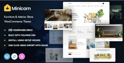
Minicom Interior Store Theme: Admin Log From Setup to Stability
-
Rebuilding a Furniture Store Site the Boring Way (and Why That Worked)
I moved a furniture and interior store onto Minicom - Furniture & Interior Store WooCommerce WordPress Theme after I hit a familiar wall: the storefront looked “fine,” but day-to-day edits were turning into a slow, error-prone ritual. The site wasn’t failing dramatically. It was failing quietly—small layout shifts on mobile, category pages that kept drifting in spacing, product pages that didn’t guide visitors through decisions, and an admin workflow that made every update feel like it might create a new problem somewhere else.
If you maintain multiple stores long enough, you stop thinking in terms of “design” and start thinking in terms of behavior: what happens when you add 50 new products, change a set of prices, publish a seasonal collection page, or update plugins on a Friday. A theme choice becomes less about visuals and more about whether the store can survive those routine operations without accumulating chaos.
This is not a review and I’m not listing features. These are field notes—what I changed, what I watched, and what I would do again if I had to rebuild an interior store from scratch.
The original issue wasn’t low conversion. It was high friction.
Before the rebuild, I tracked what tasks were costing time:
-
Adding new products was not hard, but the results were inconsistent across devices.
-
The homepage kept turning into a “catch-all” page that nobody dared to edit.
-
Category navigation existed, but it didn’t help visitors narrow down choices.
-
Product pages contained information, but the order wasn’t aligned with how people decide.
-
The overall site felt slower than it should, mostly due to layout shifting and heavy page composition.
The friction was subtle. You don’t notice it when you’re just browsing. You notice it when you’re running the store every day. It creates two predictable outcomes:
-
Admins hesitate to update content, because every update is a gamble.
-
Visitors get overwhelmed faster, because the store doesn’t guide them through a decision path.
I didn’t want to “redesign.” I wanted to reduce friction—for admins and for customers.
I started with constraints, not creativity
The first thing I did was limit how many page patterns the store was allowed to have. Furniture stores naturally want variety: different layouts for sofas, lighting, decor, sets, bundles, etc. But too much variation becomes maintenance debt.
So I defined a small set of patterns:
-
A collection landing page pattern (seasonal or curated)
-
A category page pattern (stable grid, filters, breadcrumb clarity)
-
A product page pattern (decision flow, not a content dump)
-
A content page pattern (shipping, returns, size guide, care instructions)
-
A lightweight story page pattern (if the store publishes editorial content)
Once those patterns were set, I enforced them. This is where Minicom helped me, not by giving me more options, but by letting me keep the rhythm of pages consistent without fighting spacing and layout structure every time I touched content.
Constraint is underrated. It’s how you keep a store coherent when you add hundreds of products over time.
The decision path matters more in furniture than in many other verticals
Furniture has a different browsing reality than gadgets or cosmetics. People rarely buy the first thing they see. They compare. They look for “fit” (dimensions, style alignment, materials), and they’re sensitive to trust signals (shipping damage risk, returns policy, delivery times). They also browse on mobile heavily, but often finalize decisions later on desktop.
That means your store’s primary job isn’t to look impressive. It’s to support a multi-step decision:
-
Quick orientation: “what category am I in, and what’s the range?”
-
Narrowing: filters that feel meaningful (not just technical tags)
-
Verification: dimensions, materials, care, delivery constraints
-
Trust: returns, shipping, contact, proof of real operations
-
Commitment: add to cart with minimal uncertainty
I rebuilt around that path.
I treated category pages like navigation systems, not product lists
Most store rebuilds obsess over product pages. I went the other direction: I focused on category and collection pages first.
Because if category pages are weak, visitors never reach product pages with a clear mindset. They arrive exhausted, having scrolled through a grid that doesn’t help them decide.
I approached category pages like a funnel:
-
The top of the page needed clarity: what this category is, what “counts,” and how to navigate it.
-
Filters needed to match how people think. For example, “room” and “style” often matter more than technical attributes.
-
The product grid needed consistency so that scanning works (no unpredictable card heights, no awkward image crops).
-
Pagination/infinite scroll needed to be stable, because furniture catalogs get large.
The outcome I wanted was simple: visitors should feel like they’re narrowing choices, not just scrolling.
A practical rule: “Don’t make the homepage do the store’s job”
Furniture stores often try to cram everything into the homepage: hero banners, featured products, category blocks, blog snippets, trust badges, sale sections, trending, etc. The homepage becomes fragile.
I intentionally reduced what the homepage had to accomplish. I made it an entry router, not a sales page:
-
One clear path into key categories
-
A small number of curated collections that could be rotated seasonally
-
A short trust/operations section that doesn’t require constant editing
-
An obvious path to policies (shipping/returns) without heavy text
The idea was to lower the editing burden. If the homepage is a delicate collage, nobody touches it. If it’s a stable router, admins maintain it.
The most common admin mistake: taxonomy drift
This was the most expensive problem in the old setup: categories and attributes were not managed like a system. People added terms ad hoc. Over time, filters became messy, and category pages stopped representing meaningful groupings.
I fixed this by defining a taxonomy policy. Not a complicated one—just a few rules:
-
Categories represent navigation (what visitors browse).
-
Attributes represent filtering (what visitors narrow by).
-
Tags are editorial (optional; controlled; not allowed to sprawl).
-
Every new product must fit into the existing taxonomy before it can be published.
That last rule sounds strict, but it prevents the store from becoming a warehouse of inconsistently classified items.
Furniture stores suffer from this because people love inventing names: “Modern Minimal,” “Minimal Modern,” “Scandi Minimal,” and suddenly you have three overlapping filter terms that confuse everyone.
I rewired the product page to match how people scan
Again, not a feature list, but an ordering decision.
I watched session recordings (or, if you don’t have those, you can infer behavior from scroll depth and click patterns). Visitors do not read product pages top-to-bottom. They do something like this:
-
Look at images.
-
Glance at the price and availability.
-
Scroll quickly until they see dimensions/materials.
-
Look for delivery/returns reassurance.
-
Return to images.
-
Add to cart (or leave and compare).
So I built the page to survive that scanning behavior. The first screen needed to be calm and legible. Below that, the information needed to appear in an order that answers questions as they arise.
A furniture product page that hides dimensions too deep is like a restaurant menu that hides prices—people don’t trust it.
Non-technical “performance” is often layout discipline
When people complain about performance, they often mean one of three things:
-
Real load time is slow
-
The page feels jumpy (layout shifts)
-
The page is heavy to scroll on mobile
In many WordPress stores, the most noticeable problem is the second: layout shifts caused by images, fonts, or late-loading elements.
So I made design decisions that reduce instability:
-
Consistent image ratios across product grids
-
Avoiding oversized hero sections that push content too far down
-
Keeping typography predictable so headings don’t wrap awkwardly
-
Reducing the number of “surprise” UI elements that appear mid-scroll
-
Being cautious with animations (not banning them, just not letting them dominate)
These are not glamorous changes, but they improve perceived speed and trust.
My “update day” routine shaped the rebuild
I maintain stores with a routine:
-
Update WordPress core and plugins
-
Check critical pages (homepage, category, product, cart/checkout)
-
Validate mobile behavior
-
Spot-check caching and any dynamic elements
This routine is where fragile builds reveal themselves. If every update requires manual CSS fixes, the store becomes a liability.
So I judged Minicom by whether it stayed stable during that routine. A theme that looks good but breaks under routine updates is not useful long-term.
Post-launch: the store changed in subtle ways
After a few weeks, I noticed improvements that didn’t show up as “wow” moments:
Editing became less risky
This is the biggest one. When editing feels safe, the store stays alive. Staff publish more, update products more accurately, and keep collections current.
Category browsing felt more intentional
Visitors were reaching product pages after fewer scrolls. That’s not magic; it’s usually taxonomy + grid consistency + filters that reflect real intent.
Fewer “confused clicks”
You can see this in analytics: fewer back-and-forth clicks between category and product pages, fewer quick bounces from product pages, more time spent on a smaller set of products.
It didn’t make the store “perfect.” It made the store less chaotic.
A few missteps I corrected during the rebuild
Misstep: trying to organize the store like a warehouse
Internally, you think in SKUs and inventory lines. Visitors think in rooms, styles, and constraints.
I rewrote navigation labels and collection logic to match visitor thinking.
Misstep: letting product descriptions become essays
Furniture descriptions can become long, and that’s not necessarily a problem—until they bury key facts. I separated “decision facts” from “story copy.” People need dimensions and material details faster than they need poetic language.
Misstep: overbuilding collection pages
It’s easy to turn every collection into a mini landing page with blocks and banners. That creates maintenance debt. I kept them structurally simple so we could rotate them without redesigning.
A non-competitive comparison mindset
I didn’t try to beat “some other theme.” I asked a simpler question: what kind of structure would I want if I had to run this store for two years and publish hundreds of products?
That mindset changes everything. You stop chasing novelty and start building systems:
-
Stable taxonomy
-
Consistent grid behavior
-
Predictable page rhythm
-
Low-drama editing
-
Clear visitor paths
If you get those right, the store grows cleaner over time instead of messier.
What I would do next (if the store keeps expanding)
Furniture stores eventually hit scale problems:
-
Too many similar products
-
Too many filter combinations
-
Too many categories that overlap
If I continue expanding this store, I would focus on:
-
Consolidating categories periodically (a “taxonomy cleanup” sprint every quarter)
-
Creating curated collections that reduce choice overload
-
Improving product photography consistency (the hidden driver of trust)
-
Writing operational policy pages clearly (shipping/returns/delivery constraints)
The theme doesn’t solve these by itself, but a stable theme makes these improvements easier to execute.
A closing note for admins: stability is the real conversion work
When you manage a WooCommerce store, conversion is not just marketing. It’s operational discipline:
-
The store must remain coherent as content grows
-
Pages must guide decisions without forcing them
-
Admins must be able to publish without fear
-
Mobile experience must feel calm and readable
-
Updates must not become emergencies
That’s why I treat theme choice as infrastructure.
If you’re organizing a catalog that grows month after month, it’s worth looking at the broader landscape of WordPress Themes—not to chase trends, but to pick a foundation that matches how you actually run the store.
For me, this rebuild worked because I chose the boring path: constraints first, flow second, polish last. The store became easier to operate, and that’s what keeps it healthy long after launch day.
-